My problem with most common cyborg characters is threefold.
One, don’t leave raw machinery out in the wind.
Two, don’t disregard the importance of, and the viability of, modifying the body’s systems instead of just bolting shit onto flesh.
Three, stop treating them like they’re either conflicted about their humanity or wickedly evil/perverse/have an amputation fetish.
For starters;
Harden their bones with carbon nanostructures.
Reinforce their tendons and skin with cell-wall and tissue proteins synthesized based off of Golden Orb Weaver silk.
Increase their blood oxygen saturation and reduce their resting heart rate, increase the amount of and efficiency of mitochondria in skeletal muscles.
Use TCS to improve learning ability, use other forms of neuropathy to improve dynamic visual acuity.
Use scleral implants/surgery to widen the focus distance of their eyes, and wavefront ablation surgery to improve eyesight and lens clarity.
Add silicone pads with rare-earth magnets embedded in them to provide electrosensory abilities.
Use cochlear implants to protect their hearing from loud noises, but also improve their hearing sensitivity, both through minor amplification as well as through a steroid biogel applied to the cochlea.
Flush/clear the vestibular system and use nerve-growth-promoting biogel to increase sensitivity of vestibular sense of balance.
Add a subvocalization system to the layrnx; a small peizo element with some sort of transmission system.
This is just shit I’m thinking up off the top of my head. If you write a cybernetic character, don’t neglect the fleshy parts. Recognize the ability to improve and modify them.
Remember they aren’t just human meatbags with metal bolted on; they’re a unified system of parts, mechanical and organic, and those parts need to be able to keep up with eachother.
possibly a little off-topic? but I feel like enough ppl make cyborg dragons that this could be relevant
the lack of holistic integration of inorganic/robotic + organic materials has always bothered me as well, but I don’t know enough abt robotics to comment on what’s actually wrong adsfgf, so hopefully this helps
Texturing is a technique that involves
adding local shading and details on surfaces to better represent the
material of an object.
This technique is of course closely linked to shading in general. This is usually applied after defining a global shading.
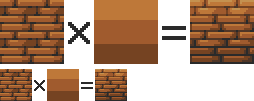
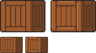
From left to right :
Lineart
Global shading
Completed sprite
One of the big differences between global and local shading is homogeneity. The
very principle of global shading is to give a sufficiently contrasting
effect between the shaded and lit areas to bring out volume and depth.
Conversely,
a texture must be as homogeneous as possible. It must be able to be
applied on large, uniform surfaces, without making it look bad.
2. Applying a texture
A
texture being homogeneous in terms of its luminosity/contrast, if it is
applied to an object without taking into account the global shading, we
will lose any effect of volume and depth.
A texture applied to a sphere without shading. Only the deformation of the texture can give us a clue on the shape of the object, but it is still difficult to discern.
Homogeneous contrast
When applying a texture to an object, shadows must also be taken into account. It
is therefore important to maintain a uniform contrast between colours. A
dark line separating a light zone from a dark zone should not keep the
same colour between these two zones.
The color of the line will be lighter on the lighter side and darker on
the darker side to preserve its contrast with the background.
In
the same way it is possible to apply a texture or pattern on a shaded
object, by proceeding to a simple color shifting in our palette.
Combination of a texture (left) and an object that is not textured but shaded (middle).
3. Local shading
Since shading is used to highlight the bumps, there are generally two possible cases:
A groove
A bump
Each of these cases can be more or less accentuated by playing on the colors, the intensity of shadows and lights.
On the upper line, troughs ranging from the weakest to the strongest bumps. On the second line, these are bumps that stand out.
The
mastery of these light bumps is very important, it is the basis of the
textures, and will make it possible to manage all the simple cases, such
as wood or matte plastic.
Example of application on a simple object:
4. Reflections
The application of a reflection is done in a
simple way, by applying diagonal strips of light of varying
thicknesses, and following a few rules.
A trough or bump will create an offset at the reflection level (proportional to the height change). As
for the shadows, there is no absolute, depending on the palette or the
material represented, it is possible to lighten or not the area at the
reflection level. It is also important not to have parallel light bands on faces that are not oriented in the same direction, as on this cube:
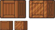
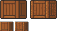
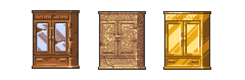
Concrete example of the application of a gold texture on our drawers:
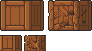
Or, added reflections on our previous crate:
5. Dithering and granularity
Dithering consists in
creating a new false color from a checkerboard or other regular pattern
of two colors close enough to give an illusion of mixing. The closer
the colours are, the stronger the illusion will be. The more the colours
are contrasted, the stronger the granularity effect will be.
Dithering is basically used to obtain fake intermediate shades on
limited palettes, but it is also very useful for making complex and
rough textures.
Example of complex dithering separating 3 colors over a wide area.
The nature of the pattern totally changes the roughness aspect.
Example of the application of a sandy rock on our drawers:
Or add grain to our crate:
6. The art of destruction
The more complex a texture is, the more it will combine fundamental techniques such as bumpiness, reflections or granularity. However, some materials need to go further, by cutting, slash or breaking the base support.
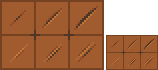
Cuts It works much like bump, but on a much finer surface. We are subject to the same rules, of which here is a summary image:
From the finest to the most pronounced, on the first line of the cuts, and on the second of the bumps.
A concrete example on our crate:
Exercises
Since nothing beats practice to learn, here is a series of examples from the simplest to the most complicated.
For each exercise resolved, post your results.
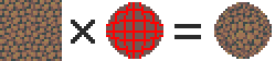
Mastering tools
Add
a strong bump on the text of this image, except the ‘x’ which must be a
groove (the center must be dug more strongly than the rest of the ‘x’):
Palette:
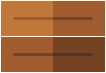
Add reflections on the image obtained between the two red lines shown below:
Now cut and break the letter ‘e’ as well as possible.
Add grain to the letter ‘l’.
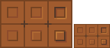
Finalize a sprite
Texturize/colorize this sprite:
Palette:
Add reflections on the inside of the doors to give the impression that there are windows.
Add damage (cuts etc) on the right side of the wardrobe.
Make a variant of this cabinet by redoing it in gold using the palette of the gold drawers example in the tutorial. Palette:
1 yard of patterned fabric (I suggest a polka dot-type pattern so it looks like suction cups)
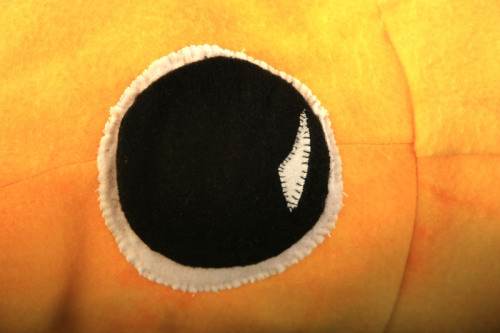
1 medium piece of black felt, 1 medium piece of white felt (for the eyes)
white thread, black thread and thread of the same color as the felt you’re using
pins
about 5 lbs. of stuffing
a couple big sheets of paper to draw your pattern
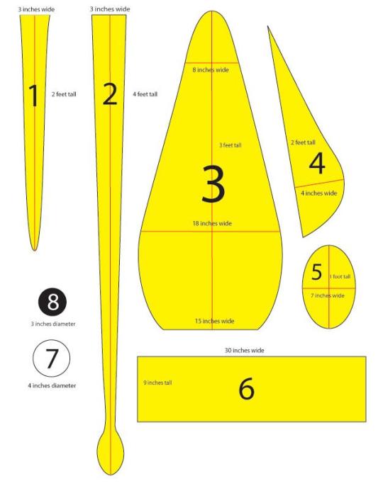
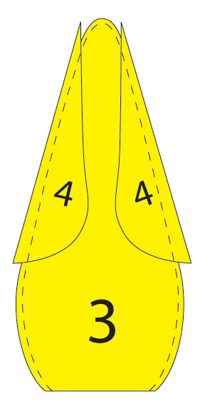
First, you need to draw out your patterns. Here’s a basic template to get you started, although most of the measurements are reasonably fudgeable. If in the likely event you don’t have any four-foot-long pieces of paper lying around, just tape a few pieces together.
Once you’ve drawn out your eight patterns, it’s time to cut the fabric. Pin the pattern to the fabric, laid flat, and cut out the following, leaving a half an inch or so of extra fabric around the edge of the pattern:
FOR THE ARMS: 8 felt and 8 fabric cutouts of piece 1
FOR THE, UH, LONGER ARMS: 2 felt and 2 fabric cutouts of piece 2
FOR THE BODY: 2 felt cutouts of piece 3
FOR THE FIN: 4 felt cutouts of piece 4
FOR THE HEAD: 1 felt cutouts of piece 6
FOR THE EYES: 2 white felt cutouts of piece 7 and 2 black felt cutouts of piece 8
So now you’ve got all your pieces ready, it’s time to start sewing them together. I did mine by hand because my sewing machine is busted and I get a kind of Zen buzz from sewing by hand, but if you have a non-busted one I recommend that you use it as it will be MUCH EASIER. You’re going to be sewing everything with the nice side of the fabric facing in, then turning it inside out to stuff it.
THE ARMS: (To make a quilted pattern that looks like suckers, see this other post). Pin together one patterned fabric piece 1 and one felt piece 1 (with the nice sides facing the inside). Sew down around the U-shape and back up, leaving the top open. Then turn the arm inside out, stuff it (it’s easiest to do both of these things if you sort of scrunch it up like you’re trying to put on a pair of tights, excuse the non-dude-friendly reference) and sew the top closed. Do the same for the other seven arms and rejoice in the fact that this is the most tedious part. Same deal with the two long arms, they’re just harder to stuff.
THE FINS: Pin together two of your piece 4s and sew together the curvy outer edge. Turn the piece inside out, so the seam you just sewed is on the inside, and start sewing up the other side, stuffing gradually as you go along. You should end up with a triangle-ish puffy thing. Repeat for the other two piece 4s.
THE BODY: Put down one piece 3, then place the two fins you have down with the point up and the curvy side pointing in, then make a sandwich by putting the other piece 3 down on top. Pin it all together and sew around the edges with the two fins still inside, as shown. Turn it inside out and move on to…
THE HEAD: So take piece 6 and the ten arms you’ve already done. Lay the arms, fabric side facing you, out with the arms’ top seams in a line half an inch from the top of piece 6. The order should be arm arm arm arm BIG ARM arm arm arm arm BIG ARM. The legs should be almost entirely covering piece 6. Pin them in place and sew a straight line through the individual legs seams to attach the legs to piece 6.
When you pick up the other side of piece 6, you now have something resembling a really weird untied hula skirt. Sew together the two 9-inch ends of piece 6 with the fabric side of the arms on the outside, and keep it inside out for the moment.
PUTTING IT ALL TOGETHER: Fit the open end of the body through the arms (still fabric side facing out) and pull the edge all the way through the felt cylinder so it’s even with the edge that DOESN’T have arms attached to it. Sew around the diameters of the head cylinder and the body cylinder to attach them, then pull the legs down over the head and you’re almost done!
Stuff the body, then seal it off by sewing piece 5 over the open end (even if you do have a functional sewing machine, you’ll probably have to do this part by hand).
THE EYES: Sew the black circles on the white circles and whipstitch the eyes onto the head. You do this last because you can’t tell where they’re going to end up on the end product if you put them on before stuffing the body.
I would advise researching how the shape of an animal’s facial structure changes as it matures. A lot of animals are born with shorter, more rounded skulls that lengthen/expand as they mature, and of course you want them to have proportions of large heads and small limbs. Bats are born with well developed, albeit small wings, they don’t need to grow them. Growth of wings if they are bat or pterosaur-like should be proportional, with the finger bones becoming longer.
Growing wings without some kind of metamorphosis in water or a chrysalis is indeed ridiculous. Bones have to develop in buoyancy until they more or less achieve their final shape and ossify, after which they grow in a somewhat linear fashion. Entire bone structures can’t grow after birth without an aquatic lifestyle, because without buoyancy, the bones would be deformed by gravity. Antlers aren’t subject to this problem because they don’t have layers of flesh putting weight on them.
That said I still don’t think an amphibious lifestyle is likely in a highly advanced creature, because it’s fundamentally r-selected. The more complex an organism is, in regards to how long it takes to mature and conversely, would NEED to take to mature because complex features just can’t develop super fast, the more K-selected a life cycle it needs. K selection is important to maximize survival rate in organisms that require a long time to reach maturity.
Long story short, if you want an amphibious lifestyle and K-selection, I have an idea for that which I use in one of my fictional creatures. Your animal could build waterproof nests and dump/cycle water in those, in which it could birth larval offspring which could undergo their amphibian-like metamorphosis in a relatively safe environment, yielding a high survival rate.
But I got off topic and rambled there a bit, haha. Some more tips I have for indicating juveniles as being distinct from adults, besides the general proportion differences, is messing with coloration, even if they don’t have feathers. Fawns have distinct fur markings different from adult deer. Pacific beetle mimic cockroaches are born with orange heads which makes the youngsters clearly distinguishable from mature animals.
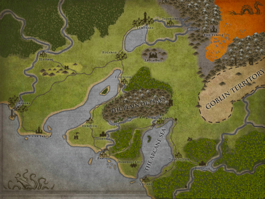
I was looking for an easy map creator that makes beautiful maps for a while now to make a visually stunning map to go along with my book. And now, after such a long search i have finally found one that suits my needs! Because i like it so much, i thought i’d share it with you guys! Just go to inkarnate.com and start creating! I have to warn you though, it is still in beta so a lot still needs to be added, but already it looks great and is easy to use!
I mean just look how beautiful some of these maps are!
And it is so much fun too! Someone even created a game of thrones map that is simply amazing!
So check it out and start creating your visual aid for your story. I promise you, it really is super easy and you will make one in no time!
three internet trends i will (regrettably) probably never grow out of:
• typing in a cresCENDO TO EXPRESS EXCITEMENT
• …………..unnecessarily……. long……….. ellipsis’
• puttinfh a typo in eveyr other word to shwo u dont really give a fukc but u actually do
also unnecessary!!!! punctuation marks??????? like…… ??? what is going on here????? i!! am!!! so!!! excited!!!!
and™ totally™ unneeded™ trademark symbols™
personally I enjoy Random Capitalisation to show things are Very Important
can we also talk about starting a sentence and then kind of just
stating something reblog if you agree
dude this isn’t even a collection of memes, this is a demonstration of internet grammar… anyone who says that when you type and communicate on the internet you lose too much inflection to get the real meaning just doesn’t understand internet syntax. the evolution of language in action.
the Rosetta Stone of the twenty first century
Also 🙂 doing 🙂 this 🙂 to express 🙂 bottled 🙂 pain 🙂
or,,,,,using commas,,,,,, for elipsis’ ,,,, bc,,, it sounds better,,, in your head,,,, than periods,,,,,,,
pu t ting sp a ces in your wor ds at r and om time s because w hat the fu ck
Is it just me, or did anyone else read all of these with different tones of voice, volume, and inflection?
Don’t forget the B I G S P A C E S F O R E M P H A S I S